There are several different kinds of design projects on this page, but if you are looking for more of a writing sample or some of my previous design work, please click here. In addition to the design work on this page, I also decided to going through the design process would help you think about what you would like to do. This page contains design work for the following projects (linked):
Logos

|

|
|
|
Document Design (Fall 2014)
|
|
While there is not much to the design of a real estate letter, it is important to note that the design criteria for this project was that it should be done in a WordDoc. InDesign has many more options that would have allowed a much more dynamic design than Microsoft Word can offer. The second example is a real estate poster that I recently completed for a coworker and made in InDesign. The two documents effectively demonstrate the differences between InDesign and Microsoft Word.
|
|
|
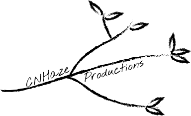
I have had my logo designed for quite some time. There is just something about the symbology behind trees that really say something to me, which is why I made it part of my logo. I also never use my full name, so I wanted that to translate too. The first version of the business card included the logo on the back with the maroon background. I kept the maroon background, but inverted the logo so I can get it embossed in silver, which will eliminate the loss of detail that happens when you make white text on dark backgrounds.
I tend to choose simplistic designs, especially for work. I rely on the less is more style, but it is more that I think that clutter is unprofessional. The letterhead is still simple, but I added a little bit more personality to it. Since I don't own my own company, I used my favorite quote at the bottom. In the corporate world, this can easily be replaced by a mission statement or slogan. Similar to the readings in our book, I made sure that the overarching shapes and lines flowed into each other to make a seamless design. A prime example of this is how the branches seem to point right to the pertinent information. |
|
|
Designing everyday documents can sometimes be a challenge, especially when they have been the same style for almost as long as they have been around. Our main task for this assignment was to make the typical boarding pass more user friendly. With my design, the most valuable information is the easiest to read, but all of the technical information is still there. The consistency in font choices was important for a document like this. If a person using this boarding pass was looking for their departure time or their seat, the unique, but still readable, font would draw their attention.
There is a continuous line of information that starts at the top. As you work your way down, you get to the most important information first. Boarding passes now have a difficult zigzag pattern in the flow. The flow of this design not only benefits the person flying, but also the airport employees. I am sure they are a pro at reading the tickets now, but a consistent flow, text direction, and font will help they do their jobs more efficiently. |
|
|
The post card was an interesting piece to work on. Again, it needed to convey a lot of information, but still remain simple. Many times in the design world, keeping things clean and simple can be hard, but I think I chose the perfect (or near perfect) combination of images to say ten times what I could in words. The assignment was to create a post card that advertised a stage play. The play was about Edison's and Tesla's battle of electricity. I had a picture that I took at the college of two students with their hands around a Tesla coil. It was the perfect image to symbolize the battle, and then I added a lightening background to bring it together. I only used a couple words on the front to keep the simplicity consistent. I also pulled colors that translated well into print, but I also took a look at the way fonts would respond in print.
|
|
|
I love doing magazine and newspaper advertisements. They are always a challenge, but they are also the ones that you learn from the best. This is where I have had some of the best client interactions. I love that they can be in color or in black and white, but the magazine or newspaper always gives you those kinds of restrictions. The top two that are in color were for a mock wedding magazine, and the bottom black and white ad was actually in the Wall Street Journal. It is really odd seeing something that I have worked on in print, but I know that I have had some good instruction along the way. I think the main thing we learned about making advertisements was to keep the pertinent information on the right hand side of the screen. In later assignments, however, we do move to the F-shaped reading pattern that most people tend to use.
|
|
|
Trifolds are one of my favorite things to design because there are so many options when you put them together. This trifold isn't made with the traditional accordion fold design. It opens like a book which gives you a better workspace for the middle. There was quite a bit of information to get on the trifold, and you can't really make a "continue reading" bar like in the newsletter below. This is why it is important to understand the information you are designing. It will come to you in all different ways, and sometimes it won't be in order. One of the biggest challenges of creating and designing documents, however, is not sacrificing design for information.
I wasn't happy with my first attempt. I didn't like the cover because for me, it looked too much like a word document. I played with the design a little bit and looked for ways that I could create symmetry and consistency. There is a consistent gold color throughout the document that I chose, the purple is the color that the client's other documents are, and the red color is actually pulled from the pied piper's cloak. After I moved the Johns Hopkins logo to the back, it made for a much better, cleaner canvas for the front cover. Really, I don't know why I put the logo on the front in the first place; it looks much better on the back. In the before you didn't really get that the pied piper was really drawing you into the document, or that he is pointing the way for the document to be opened. The gold lines really stress linear motion to reinforce the picture now. I didn't change anything in the middle of the document because I was happy with the way it turned out. I like that it doesn't follow the typical three column design, nor does the information get lost in the folds. It is a clean, f-style layout that makes it easier for the public to locate and read information. Overall, I am pretty happy with the second design. |
|
|
I have worked on a lot of newsletters , but let me tell you, they get more difficult with every new format you learn. I normally produce documents like the "Inside Track" on the bottom. It is a monthly add-in to our emailed newsletter (produced by email template). The "Inside Track" has recently become a pet project too. When I took it over it was a strict three column design with a lot of rigidness to it. Now the basic format and colors stay the same, but the boxes have a little more give and they are a little bit more dynamic.
Back to the newsletter, the first attempt wasn't finished by any means. I had forgotten to insert the mailing information, so adding pages and fixing the page positions was time consuming. After I completed moving things around and finishing the rest of the criteria, I think it came out really well. It is set up for the new mailing guidelines, where the opening must be at the top of the document and plenty of space to be able to change things as the newsletter changes. The newsletter has a large variety of design features, but it still stays consistent in the colors, fonts, and headers. If you have looked at all of these assignments closely, you will have noticed that I tend to choose the same body font (Avenir) because it is clean and has a lot of options to work with. Many electronic documents, like the "Inside Track" need to have a simple sans-serif font like Avenir because it is easier to read on the screen for long periods of time. Something like the printed newsletter could really use either. In print you have a greater variety of fonts you can use, but you are limited on color combinations/costs. Electronic is always a little more difficult because you have to really think about the design features like a hyperlinked table of contents, like the one on this page, and readability. |
|
Lo-fi websites are always fun and interesting. Sometimes depending on the system you are using it can be easier or harder. For this assignment, we used a straight HTML editor with a preview window. It differs from DreamWeaver because you can't use CSS, you have to use tags. I just took a screenshot of the Lo-Fi website because who wants to look at HTML. By the colors, you can tell that it is hyperlinked using a bookmarks system, kind of like the system I coded for the "Back to top" and the list above. I was trying to make a resume using a system of tables, but tables always take a long time. Tables are a complex way to make a site, but sometimes it's necessary. For my design/redesign project below, the email template portion had over 20 tables in the email template alone. It may be easier to use the next assignment, the Content Editor Site, but it is always good to know the code behind the site.
|
|
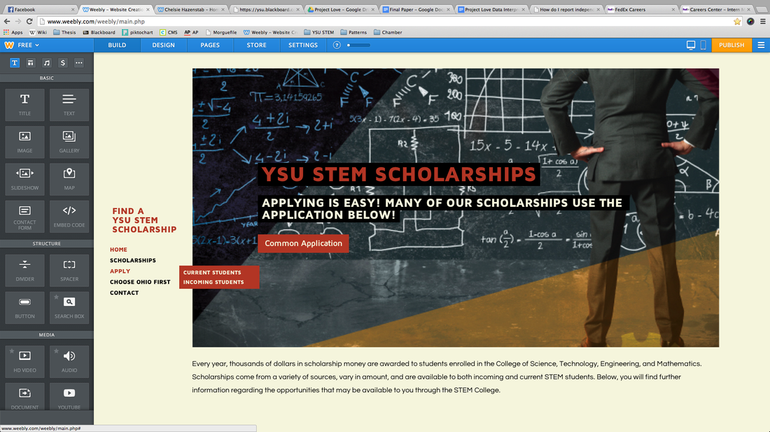
I took a picture of this one too because I cannot actually publish this one. While I have been a YSU STEM intern and have access to all of their information and all of their pictures, I'm not completely sure that all of the pictures they use are completely free. The premise behind this site is more to learn about how to design, rather than how to code. While the original colors of the template for the YSU STEM Scholarships were white and blue, I changed them to a cream and red through the HTML. Like I said above, knowing the HTML behind the scenes is a good thing; I don't have to stick with the template. The YSU STEM Scholarships site was built off of the same site that this website is built off of and it designed in much the same way. I prefer minimalist design on the web because I don't think you should be bombarded with information. It should be succinct and to the point on the web, unless you are presenting PDF's, but you still need a clean, organized design. The YSU STEM site is a little different than I would normally design because I chose to use a left column navigation bar. You don't normally see these by themselves, I thought it matched what I was trying to go for, especially with the extra long banner. That design choice would definitely not be for everyone.
|
|
|
I have always hated fillable forms with a passion, mostly because people never do them right. In the older versions of Adobe, you can just hit a button and all of the boxes would become fillable. This was fine until they changed the way the forms save. Now they come in a XML file that is impossible to read properly. Now, you have to make each of those boxes fillable by themselves. It takes a long time, and it is just easier to come up with a website, like this one, and create a page with a contact form all ready to go.
With this form, I took another form that I had already made and replaced the text. The colors are consistent and so is the text. There is a continuous flow throughout the whole document that improves the readability. The important reminders are in red, which catches the eye. All of the fillable boxes should be outlined, too, but sometimes Scribd like to make things a little wonky. I also have this form set to be emailed to an address that was provided. |
|
|
For my Design/Redesign project, I took the Chamber’s two newsletters and combined them into one email template to reduce the amount of miscellaneous emails we send out because people never bring their stuff in on time. By making it bi-monthly, we will be able to shorten both emails and catch all the stragglers. I also worked on a brochure about the ranks that Youngstown holds. While I cannot post the email template because I don't have the permissions, I am able to post the brochure.
I started by sketching out some ideas, and then going to work making a template. My first template was terrible, so I decided to start from scratch and I hand coded a template from beginning to end with I think 20 different tables. The new template comes complete with navigation buttons, which through discussion with my boss, now look like actual buttons. They work, I’ve tested them, but they won’t work unless you have the email. It took me approximately two months to complete this process using our ExactTarget email system. I chose to stick with the Chamber colors, since this is our brand, but I used them a little differently when I chose simple gradient. Our emails before had way too much going on in them so I simplified them. After we simplified the email structure, I moved on to actually simplifying the entire registration process. This whole project made me realize that sometimes even the easiest things can be over complicated and that is what we were doing. Plus our emails were a mile and a half long, which from everything I have learned in school, is not a good thing. Kim, my boss, can be very picky. The email template is by no means completely done for her, and I am sure there will be many tweaks that she will have me do. Luckily, she is on board with most of my design decisions. I also made a trifold for the Chamber, that Kim edited several times, but it is now a printed document. I had four pages of information to fit on a regular sized trifold, and with a lot of work, rework, and editing, I finally got everything to fit. We couldn’t take out anything, which was incredibly frustrating. For that document, I used InDesign and Microsoft Word. That took me a couple weeks to complete too. Since this document was meant to compliment another, I took design elements, like the light blue boxes and colors, from the that document to add to the new document. I had not originally planned to turn this one in, but since it was printed professionally and I learned a lot about the printing process, I thought it would be nice. Bill, who works for Knepper in Pittsburg, helped me a lot with figuring out my margins and the high resolution logo. I have used this information at least ten times since then, especially when setting up our trifold for class. |
